
Your website works like a storefront window. Within seconds, website visitors decide if they’ll stay or move on to a competitor. The difference often comes down to how well your web design speaks to the subconscious mind.
Understanding website layout psychology can transform your online presence into a lead-generating machine. This guide explores the mental patterns that drive how users interact with websites and shows you how to apply them for better results.
How the Brain Processes Web Pages
When someone lands on your site, their brain doesn’t read every word from top to bottom. Instead, it scans for patterns and prioritizes information based on visual elements. This happens in milliseconds, long before conscious thought kicks in.
Research using eye-tracking in website design reveals that people follow predictable patterns. The most common reading pattern is the F-shaped one.
In this pattern, eyes move across the top of the web page. Then, they go down the left side and make occasional sweeps to the right. This forms an “F” pattern that shows up when you look at website heatmaps.
A marketing agency ran tests and discovered that 80% of website visitors never scrolled past the first screen. By changing their main offer to fit the F-shaped reading pattern, they raised inquiries by 34% in just two weeks.
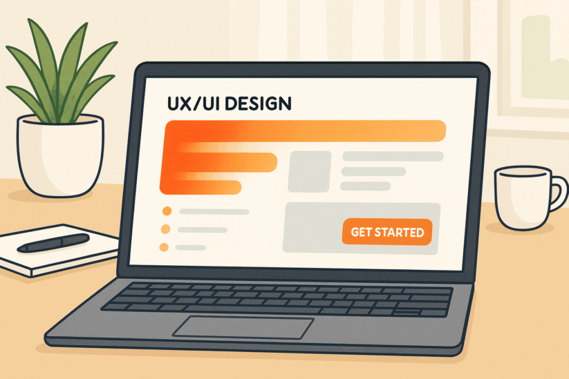
Visual Hierarchy in UX: Guiding Eyes Where They Matter
Visual hierarchy in UX refers to arranging design elements in order of importance. Your brain automatically gives more weight to larger items, bold colors, and elements with more white space around them.
Consider these hierarchy principles:
- Size matters. Headlines should dominate, followed by subheadings, then body text. Making everything the same size creates visual noise and confuses website visitors. This applies whether you’re designing a homepage, product page, or blog post.
- Contrast creates focus. Dark text on light backgrounds improves readability by 60% compared to low-contrast combinations. Using contrasting colors for conversions goes beyond aesthetics. It directly impacts whether people can process your message quickly.
- White space isn’t wasted space. Empty areas around important design elements make those elements stand out more. When a web page feels cramped, it increases cognitive load. This means visitors’ brains work harder and may give up.
The Power of Persuasive Web Layout Examples
Real businesses have proven that small changes produce dramatic results. A software company moved their pricing table from the bottom to just below the main benefit statement. This simple shift in call-to-action placement strategy increased free trial signups by 47%.
Another consultant changed only the color of their contact button. By switching from green to orange (creating stronger color contrast for conversions), they saw a 21% increase in clicks. The content stayed identical; only the visual prominence changed.
These data-driven design improvements work because they reduce friction. When website visitors can instantly understand what action to take, conversion rates climb.
Understanding Cognitive Load in Design
Cognitive load refers to the mental effort required to use your website. High cognitive load frustrates users and drives them away. Low cognitive load creates a smooth experience that guides visitors toward taking the desired action.
Three factors increase cognitive load:
- Too many choices overwhelm decision-making. When a homepage presents eight different paths forward, visitors often choose none. Limiting options to two or three primary actions simplifies the journey.
- Unclear navigation forces users to hunt for information. If someone can’t find your product or service within three clicks, they’ll likely leave. Clear labels and logical structure reduce this mental burden.
- Distracting design elements pull attention in too many directions. Animations, pop-ups, and flashing banners often backfire by interrupting the natural flow of discovery.
Conversion-Focused Web Design in Action
The most effective website design strategies blend psychology with aesthetics. Every design element should move website visitors closer to taking action.
Start with your value proposition. This should be the first thing people see, positioned in the prime real estate of your F-shaped reading pattern. Use clear, benefit-focused language rather than clever slogans.
Next, build trust through credibility markers. Testimonials, client logos, or specific results all help establish confidence. Place these visual elements strategically where the eye naturally travels during that initial scan.
Then, remove distractions. Each web page should have one primary goal. Multiple competing call to action buttons create decision paralysis.
Landing Page Optimization: Where Conversion Happens
Landing pages represent the highest-pressure moments in your conversion funnel. Someone clicked through with a specific expectation. Your landing page must immediately confirm they’re in the right place.
Effective landing page optimization follows a proven structure. The headline matches the promise that brought visitors there. The sub-headline expands on that promise with a clear benefit. Supporting content provides just enough information to overcome objections without overwhelming.
The CTA button deserves special attention. This call to action button should stand out through size, color, and placement. Vague labels like “Submit” convert poorly compared to specific alternatives like “Get Your Free Analysis” or “Start Saving Today.”
Design Elements That Increase Sales
Certain UX design principles for conversion appear consistently across high-performing websites. These aren’t trends. They’re backed by extensive usability testing across thousands of sites.
- Directional cues work surprisingly well. Arrows, pictures of people looking at your call to action button, and soft shadows help guide users to take action.
- Progress indicators reduce abandonment on multi-step forms. When people see they’re on “Step 2 of 3,” they’re more likely to complete the process.
- Scarcity and urgency increase immediate action, but only when used honestly. Fake countdown timers damage trust and long-term conversion rates.
The Role of Color in User Experience and Lead Generation
Color psychology influences emotions and actions. While individual preferences vary, certain patterns hold true across demographics.
Blue conveys trust and stability. Red creates urgency and excitement. Green suggests growth and positive action.
The most important factor isn’t which color schemes you choose, but how you use contrast. Your primary CTA button needs to stand out from everything around it. If your site uses mostly cool colors, a warm-colored button will draw the eye naturally. Using contrasting colors makes your call to action button impossible to miss.
Mobile-First Thinking for Modern Conversions
More than half of web traffic now comes from mobile devices. Conversion-focused web design starts with the mobile experience. Buttons need to be large enough for thumbs. Text must be readable without zooming. Forms should minimize typing by using dropdowns and auto-fill.
The most successful approach is responsive web design that adapts layouts based on screen size. A three-column layout on desktop might stack into a single column on a mobile device.
Testing Your Way to Better Results
No amount of theory replaces actual usability testing with real users. The businesses seeing the biggest improvements in user experience and lead generation test regularly.
Start with small changes. Test different headlines, CTA button colors, or image placements. Track the results over at least a few hundred website visitors to get meaningful data.
Tools for heatmap analysis show you exactly where people click, how far they scroll, and where they abandon your site. This information is gold for identifying friction points.
A fitness studio owner used heatmap data that showed visitors clicked on images. By linking those images to the membership page, conversions went up by 18%—without changing the web design.
Building Trust Through Design
Persuasive web layout examples all share one thing in common: they build trust quickly. Visitors arrive with natural skepticism.
Professional photography makes a huge difference. Stock photos of generic office workers signal “we didn’t invest in showing our real business.” Authentic images of your actual team, location, or work create immediate credibility.
Security indicators matter more than many realize. SSL certificates, trust badges, and clear privacy policies all contribute to visitor confidence.
Social proof—reviews, testimonials, case studies—provides third-party validation. Place these elements near your call to action button.
Speed as a Conversion Factor
Even the most psychologically optimized web design fails if pages load slowly. Research shows that 40% of visitors abandon sites that take more than three seconds to load. Every additional second of delay reduces conversions by roughly 7%.
Optimizing images is the fastest win for most sites. Large, uncompressed files cause most slow load times. Tools can reduce file sizes by 70% or more without visible quality loss.
Web design experts include performance optimization as standard practice. Beautiful design means nothing if visitors leave before seeing it.
The Psychology of Button Placement and Wording
Call-to-action placement goes beyond putting buttons on a page. Where they appear and what they say dramatically impacts conversion rates.
Above the fold placement works well for simple offerings. For complex products or services, placing the CTA button after explaining value converts better.
Button wording should focus on the benefit, not the action. “Get My Free Consultation” outperforms “Submit” because it reminds visitors what they’re getting. First-person language creates ownership.
Learning from Failed Designs
Sometimes the best lessons come from what doesn’t work. A tech startup once made a homepage with auto-playing video and animations. Visitors had to complete a quiz before seeing the product. Their bounce rate hit 89%.
After simplifying—static hero image, three bullet points, one clear CTA button—bounce rate dropped to 34% and conversions tripled. Creativity should serve usability, not replace it.
Measuring What Matters
Data-driven design improvements require tracking the right metrics. Many businesses focus on vanity numbers that don’t reflect business value.
Traffic volume matters less than quality. Ten thousand visitors who leave immediately are worth less than 1,000 who engage. A 10% conversion rate from that smaller group means higher revenue.
Conversion rate is the ultimate metric: the percentage of visitors who take your desired action. Going from 2% to 3% conversion means 50% more customers from the same traffic.
Bringing It All Together
Effective conversion-focused web design is about understanding how people think—what grabs attention, builds trust, and encourages action.
Map the mental journey you want visitors to take. What do they need to see first? What objections will arise? What proof do they need? Design your layout to guide users naturally through that journey.
Test everything. What works for one business might not work for yours. Discover what resonates through systematic testing.
Good web design is invisible. When everything flows naturally, visitors focus on your message and offer instead of fighting your interface. That seamless experience is where conversions happen.
The businesses winning online aren’t necessarily those with the biggest budgets. They’re the ones who understand website layout psychology and apply it consistently. They give every design element purpose, all working toward one goal: turning potential customers into real ones.
Additional Resources
To understand user behavior better, check out Nielsen Norman Group’s research on eye-tracking studies. This research offers valuable data on how users interact with web pages and make choices.
To understand page speed and how it affects conversions, visit Google’s PageSpeed Insights. It provides tools and tips for measuring and improving website performance.
Frequently Asked Questions
What is website layout psychology?
Website layout psychology is the study of how people think and behave when they visit a web page. It looks at how visual elements, colors, and placement affect whether visitors take action or leave. Understanding these mental patterns helps you design websites that guide users toward becoming customers.
How does the F shaped reading pattern affect web design?
The F-shaped reading pattern describes how most people scan a web page. Their eyes move horizontally across the top, then down the left side with occasional rightward sweeps, forming an “F” shape. Smart designers place important content, headlines, and call to action buttons along this natural eye path to capture attention and increase conversions.
What is cognitive load in design and why does it matter?
Cognitive load refers to how much mental effort visitors need to use your website. High cognitive load happens when a site is confusing, cluttered, or has too many choices. This frustrates users and makes them leave. Low cognitive load creates a smooth, easy experience that guides people toward taking your desired action without thinking too hard about it.
How important is color contrast for conversions?
Color contrast is extremely important for conversions. Your CTA button needs to stand out from everything else on the page. Using contrasting colors makes your call to action impossible to miss. Studies show that simply changing button colors to create stronger contrast can increase clicks by 20% or more without changing any other design element.
What makes a good call to action button?
A good CTA button combines three elements: size, color, and wording. It should be large enough to notice but not overwhelming. The color should contrast sharply with surrounding design elements. The wording should focus on benefits rather than actions. For example, “Get My Free Guide” works better than “Submit” because it reminds visitors what they’re getting.
How can heatmap analysis improve my website?
Heatmap analysis for websites shows you exactly where visitors click, how far they scroll, and where they leave. This data reveals friction points you might not notice otherwise. You can see if people are clicking on images expecting them to be links, missing your CTA button, or abandoning forms at specific questions. These insights guide you to make targeted improvements that boost conversions.
Why is mobile first design important for conversions?
What is visual hierarchy in UX design?
Visual hierarchy in UX is arranging design elements by order of importance. Your brain automatically gives more attention to larger items, bold colors, and elements with white space around them. Good visual hierarchy guides website visitors through your content in the right order, making sure they see your most important messages first and understand what action to take.
How does page speed affect conversion rates?
Page speed directly impacts conversion rates. Research shows 40% of visitors abandon sites that take longer than three seconds to load. Every additional second of delay reduces conversions by about 7%. Even the most beautifully designed website with perfect psychology fails if it loads slowly. Fast loading times keep visitors engaged and more likely to become customers.
What role does social proof play in conversion focused web design?
Social proof includes reviews, testimonials, and case studies that show other people trust your business. This third party validation is powerful because visitors arrive with natural skepticism. Seeing that real customers had positive experiences helps build trust quickly. Place social proof near your call to action buttons where people are making decisions, and conversions will increase significantly.