Improve Your Sales by 100% – How to design a user-friendly website form.
Web forms are a way websites obtain data from their visitors and customers to preserve for future reference. They are required for many things, such as signing up for newsletters, making online purchases, giving feedback about various products and services, etc., so in most cases, they are the entry point of interaction between the user and the website or app.
Web forms should be simplified to make them more user-friendly. They should be easy to complete and self-explanatory. The user should feel empowered and in control, as if they are managing manageable tasks and are self-motivated to fill them out.
So, if you are a web designer or a developer and looking to simplify web forms, here are some tips that may come in handy:
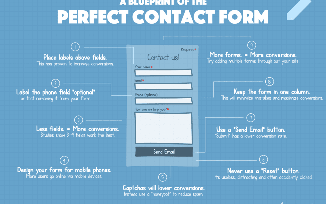
Keep the web form relevant: – If your web form mandates a lot of information from the user, ask yourself how and why that information is helpful to you. Keeping the form relevant will make it easier for the user to complete. The number of fields should be kept to a minimum. When a new user lands on your form page and sees many fields that need to be filled in, It will make them think, “Do I have time for this.” If it’s essential, they may take the time anyway, but if you push to get contact info, they may move on. An excellent real to go by is if you must scroll to view the complete form, it may be too long.
Make your web form logically communicative: – Design the form in a way that carries some logic. A web form should be comparable to a normal human conversation regarding the order of things you want to enquire about. The perspective of the user should be taken into account, making them feel considered and valued. Questions should be organized in a way that similar questions are grouped. This would make transitioning from one set of questions to another much easier. It can be overwhelming if a user is bombarded by questions in a haphazard order. Confusing a visitor can only push them away.
Eliminate duplicate fields: Many websites require the user to duplicate a certain bit of information. But since most people copy and paste the information, the mandate’s point is defeated. Therefore, duplicate fields should be eliminated. Most form plugins allow you to auto-fill fields that may need duplicating. Please don’t confuse the user.
Highlight what is optional: – As mentioned earlier, the requirement of unnecessary information should be addressed in all web forms. However, if your web form requires optional fields, please ensure the optional areas are brought to the user’s notice. The distinction can be made with characters or colors.
Try to make the web as automated as possible: With more and more people using their mobile devices to access websites and apps, typing is becoming problematic because of the smaller device screens. Also, typing is quite prone to errors. Therefore, a user-friendly web form should minimize the need for data typing, and some apparent fields can be prefilled or auto-completed. You may also like to opt for a completely different form for mobile devices. Could you create a duplicate form but remove the secondary fields? You are better off getting the contact info than not getting anything.
Remove the reset buttons: – Imagine going through a long web form, filling it out, and then accidentally falling back to square one just because the save button is adjacent to the reset button. By removing the reset button, you can relieve your users from this potential stress and make the web form experience more straightforward.
Frequently Asked Questions
Why is designing a user friendly website form important?
A user friendly form improves the user experience, increases submission rates, and reduces frustration. It makes it easier for users to interact with your website and complete actions like signing up or making inquiries.
What are the key elements of a user friendly form?
Key elements include clear labels, minimal fields, logical layout, mobile responsiveness, inline validation, and concise instructions to guide the user through completion.
How does field length affect usability?
Appropriately sized fields help users understand what type of data is expected. Too short or long fields can create confusion or cause users to abandon the form.
Should I use multi step forms for better usability?
Multi step forms can be helpful for lengthy submissions by breaking them into manageable sections, reducing cognitive overload and improving completion rates.
What role does form feedback play in usability?
Real time feedback helps users correct errors as they fill out the form, reducing frustration and improving the overall experience.
How can I ensure my form works well on mobile devices?
Make sure your form is responsive, uses large touch targets, auto adjusts to screen size, and keeps input simple to ensure usability on all devices.
What are some common mistakes in form design?
Common mistakes include too many required fields, poor error handling, unclear labels, lack of mobile responsiveness, and not prioritizing user privacy.
How do I optimize forms for accessibility?
Use proper label tagging, logical tab order, descriptive error messages, and ARIA attributes to make forms accessible for screen readers and users with disabilities.
What’s the impact of visual hierarchy in form design?
A clear visual hierarchy helps guide users through the form step by step, emphasizing important elements and reducing cognitive load.
Should I use CAPTCHA or other anti spam tools?
Yes, lightweight and user friendly CAPTCHAs can prevent spam without negatively impacting user experience especially invisible or checkbox based solutions.


