
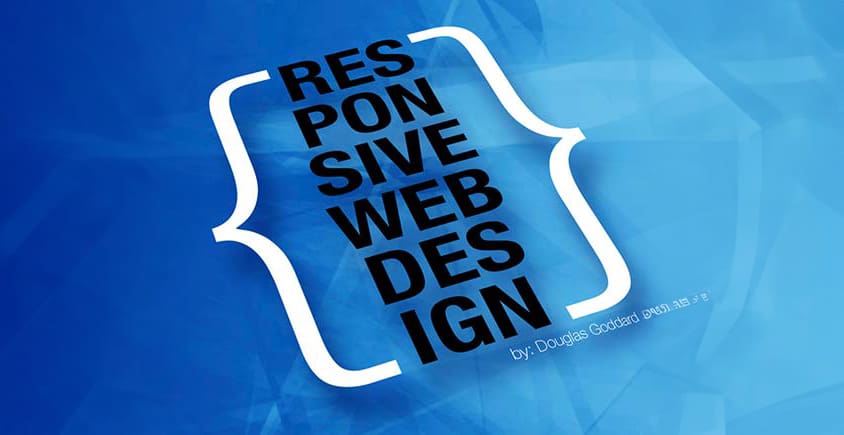
(Q) What is Responsive Website Design?
(A) A responsive website will auto-adjust to the viewing device. Smartphone, Tablet / iPad, Computer screen 11″ – 27″.
(Q) Why do I need a Responsive website?
(A) mobile/smartphone searches have continued to increase over the past five years—almost 50% increase year after year. If your site is too complex to see on a mobile device, you lose out on potential customers.
Web design technology is very different than it was five years ago. The big push is smartphones, tablets, and iPads. All have pushed the web design industry to develop new forms of code, allowing the same data to be delivered in smaller bits much faster. Today, it’s essential that your site loads quickly on all devices: Smartphones, iPads, tablets, and wireless computers. Designing your site with responsive website design technology will allow all your users to view your site, no matter their device, quickly. Today, you don’t need two websites: mobile and computer. Responsive web design allows you to have one site that adjusts to the users’ device.
Designing a website is no longer just about the computer. Before hiring a responsive web designer or developer, I would like to ask how your site will perform on various devices. If they don’t have a satisfactory answer, It’s a red flag. In such a case, we encourage you to contact us for expert advice.
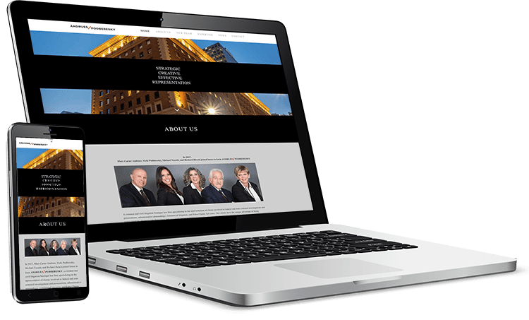
We have included a few samples of the different versions of how a site would look on various device sizes. The vital thing to think about is usability. The user should not have to zoom in and out to read. If you make the user work too hard, they will give up and go somewhere else. Don’t make the mistake of thinking no one uses anything but a computer to view your site, and never use Flash as a central part of any page on your site. Many devices can’t see Flash.
Interested in delving deeper into the world of mobile website design? We invite you to explore our comprehensive article on the topic. It’s a great way to expand your knowledge and stay ahead in the digital landscape.
Want to learn more? Give us a call.
Drop us a note here. »
: by Douglas Goddard
Samples of our site on different devices.
Frequently Asked Questions
What is responsive website design?
Why should I make my website responsive?
What are the foundational techniques used in responsive design?
Key techniques include fluid grid layouts, responsive images (using max width and srcset), flexible typography, and well placed media queries.
What is a mobile first design approach?
Mobile first means designing for smaller screens first and progressively enhancing for larger devices using media queries tailored to each breakpoint.
How are breakpoints used in responsive design?
Media query breakpoints at typical widths like 480px, 768px, 1024px, and 1440px allow you to adjust layout and styling for mobile, tablet, and desktop views.
Why use relative units like %, em, rem, vw/vh instead of px?
How can images and media be made responsive?
Use attributes like max width: 100%, height: auto, srcset, and
What role do CSS frameworks and layout techniques (e.g. Flexbox, Grid) play?
How should I test responsiveness across devices?
How does responsive design benefit my website’s performance and SEO?
A responsive, fast loading website improves user satisfaction, decreases bounce rates, enhances Core Web Vitals, and signals mobile-friendliness to Google.
Turn Responsive Website Design – Why you should update your website into a clearer next step
Responsive Website Design – Why you should update your website becomes more useful when the takeaway is connected to web design company support, website clarity, and measurable lead quality. PX Media can turn Responsive Website Design – Why you should update your website into a practical review of layout, navigation, forms, calls to action, speed, mobile experience, content clarity, and tracking so the next move supports the business instead of adding more noise.
Custom Website Design
Responsive Website Design – Why you should update your website pairs well with Custom Website Design when you want a clearer next move before changing campaigns, design, or measurement.
Pasadena Web Design Company
Pasadena Web Design Company gives Responsive Website Design – Why you should update your website a stronger follow-through path for planning, service review, and practical action.
Local Digital Marketing Agency
Local Digital Marketing Agency can connect the ideas around Responsive Website Design – Why you should update your website with a more focused service conversation.
Blog & Press
Responsive Website Design – Why you should update your website often leads into Blog & Press when the goal is better clarity, cleaner tracking, or stronger lead quality.
Talk To Us
Talk To Us can help turn the takeaways from Responsive Website Design – Why you should update your website into a more specific plan for your business.
Questions that come up after Responsive Website Design – Why you should update your website
How does Responsive Website Design – Why you should update your website fit into a practical web design company support plan?
Responsive Website Design – Why you should update your website can help clarify where web design company support needs more attention, especially around content hierarchy, mobile usability, speed, conversion flow, and clear service messaging. With Responsive Website Design – Why you should update your website as the starting point, PX Media shapes next steps that are easier to measure and easier for visitors to act on.
What should a business review before acting on Responsive Website Design – Why you should update your website?
Before making changes after Responsive Website Design – Why you should update your website, it helps to review layout, navigation, forms, calls to action, speed, mobile experience, content clarity, and tracking. That keeps decisions around Responsive Website Design – Why you should update your website grounded in real visitor behavior, lead quality, and the business outcome that matters most.
When is it worth asking PX Media for help after Responsive Website Design – Why you should update your website?
It is worth asking for help when the issue behind Responsive Website Design – Why you should update your website feels scattered, hard to measure, or disconnected from qualified inquiries. PX Media can review the current setup and help turn Responsive Website Design – Why you should update your website into a clearer action plan.
Need help applying Responsive Website Design – Why you should update your website?
PX Media can review the current setup behind Responsive Website Design – Why you should update your website, clarify the strongest opportunity, and connect web design company support with a cleaner plan for visibility, conversion, and follow-up.