
Need help turning your palette into a consistent look across print and digital? See our Graphic Design Services.
Understanding Santa Monica’s Natural Colors
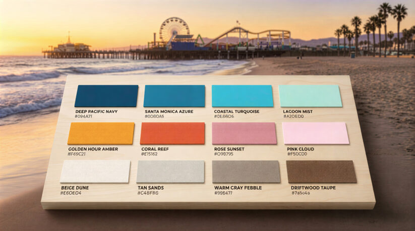
Santa Monica and the broader Los Angeles area offer amazing color inspiration. Ocean-inspired color schemes California businesses use draw from the blues you see from the pier. These range from deep navy to bright turquoise. Ocean blues help with building trust and create calm feelings, making them perfect for wellness brands.
The sunset color palette Santa Monica is famous for captures warm oranges, soft pinks, and golden yellows. These vibrant colors bring energy and creativity to your branding. Hospitality brands often use these tones to feel welcoming and exciting.
Sandy neutral color palette branding completes the coastal color palette Santa Monica businesses love. Beiges, tans, and warm grays provide versatile backgrounds that make bolder colors pop. These create visually appealing designs that photograph well in bright California sunlight.
Color Psychology for Different Industries
Understanding the branding color psychology California coast businesses use helps you make smart choices. The psychology of colors plays a crucial role in how people feel about your brand.
Color psychology for wellness brands in Santa Monica shows that calming colors work best. Soft blues, sage greens, and sandy neutrals create a sense of peace and healing. These visual elements reduce stress and help clients imagine the relaxing experiences you provide.
Hospitality brand colors Santa Monica venues choose need to balance excitement with comfort. Restaurants, hotels, and bars often use sunset tones that feel inviting. A beachfront restaurant might feature ocean blues with golden highlights to connect dining directly to the beach setting.
Creative brand color ideas Santa Monica agencies explore often go beyond obvious beach themes. While they use beach city color palette branding elements, they also add unexpected pops of color. A design studio might pair deep navy with electric yellow for a bold, modern look.
How to Choose Brand Colors Santa Monica Businesses Can Own
Learning how to choose brand colors Santa Monica businesses succeed with requires research. Start by looking at your competitors. Your goal is finding opportunities to stand out, not copying them. If every wellness center uses light blue, choosing sage green or terracotta helps you create a unique brand experience.
Think about your target audience and what they expect. Younger people often like bolder, brighter santa monica brand color palettes. People seeking premium services prefer sophisticated, muted tones. A coffee shop targeting college students might use energetic colors, while a luxury spa would choose elegant neutrals.
Test your color scheme across different uses before finalizing it. Santa monica logo color ideas need to work in bright sunlight, on screens, in print, and on signs. Colors that look great on a computer might appear washed out on a sunny storefront.
Local branding color trends santa monica sees change over time, but coastal connections stay relevant. Staying aware of shifts helps your brand feel current without chasing every trend.
Building Consistency Across Your Brand
Color consistency across brand touchpoints strengthens how people remember you. When customers see the same colors in your logo and website, they remember your brand better. This includes your social media, business cards, and store. Consistent colors help strengthen brand recognition.
Most brands need more than two colors. A complete color palette usually has one to three main colors. It also includes two to four accent colors and neutral colors for backgrounds.
Primary colors form your core identity. These appear in your logo and define your brand at first glance.
Secondary colors provide flexibility. They let you create varied marketing materials without losing your identity. Neutral colors handle practical needs like readability and work well for interior design applications.
Document your colors with specific values. Use HEX codes for websites, RGB for screens, CMYK for printing, and Pantone numbers for exact matching. This ensures consistent branding across everything you create.
Making Colors Work in Los Angeles
The impact of colors in bright California sunshine differs from other places. Work with experienced designers who understand how colors perform in different lighting. Professional teams, like those offering comprehensive branding services, can guide you through testing and refinement.
Create brand guidelines showing exactly how to use your colors. Specify which colors appear where, provide examples, and include technical values. These guidelines prevent mistakes that weaken your visual identity.
Physical materials need special attention. Paint, fabric, and printing inks have limits. Work with vendors who understand color matching. For businesses with both online and physical presences, coordinating digital and physical colors is essential.
Common Mistakes to Avoid
Brands that follow trends too closely quickly look dated. Ground your color palettes in timeless coastal elements instead. Using too many colors dilutes impact. Most effective brands stick to five to seven total colors.
Ignoring accessibility excludes potential customers. Make sure text colors provide enough contrast against backgrounds. Check your choices against accessibility standards so everyone can engage with your brand.
Getting Started
If you’re launching a new business that needs strong visual identity, professional guidance helps avoid expensive mistakes. The right color scheme helps you connect with your audience. It builds a brand that stands out in Santa Monica’s busy market.
Your colors should reflect both your business values and the beautiful coastal environment that makes this area special. Take time to choose thoughtfully, test thoroughly, and implement consistently for the best results.
Turn How to Choose Brand Colors Santa Monica Businesses Love into a clearer next step
How to Choose Brand Colors Santa Monica Businesses Love becomes more useful when the takeaway is connected to logo design support, website clarity, and measurable lead quality. PX Media can turn How to Choose Brand Colors Santa Monica Businesses Love into a practical review of brand assets, logo use, photography, printed materials, website visuals, and conversion context so the next move supports the business instead of adding more noise.
Santa Monica Logo Design Service
How to Choose Brand Colors Santa Monica Businesses Love pairs well with Santa Monica Logo Design Service when you want a clearer next move before changing campaigns, design, or measurement.
Graphic Design Services
Graphic Design Services gives How to Choose Brand Colors Santa Monica Businesses Love a stronger follow-through path for planning, service review, and practical action.
Santa Monica Digital Marketing Agency
Santa Monica Digital Marketing Agency can connect the ideas around How to Choose Brand Colors Santa Monica Businesses Love with a more focused service conversation.
Blog & Press
How to Choose Brand Colors Santa Monica Businesses Love often leads into Blog & Press when the goal is better clarity, cleaner tracking, or stronger lead quality.
Talk To Us
Talk To Us can help turn the takeaways from How to Choose Brand Colors Santa Monica Businesses Love into a more specific plan for your business.
Questions that come up after How to Choose Brand Colors Santa Monica Businesses Love
How does How to Choose Brand Colors Santa Monica Businesses Love fit into a practical logo design support plan?
How to Choose Brand Colors Santa Monica Businesses Love can help clarify where logo design support needs more attention, especially around visual consistency, brand recognition, message clarity, sales materials, and website presentation. With How to Choose Brand Colors Santa Monica Businesses Love as the starting point, PX Media shapes next steps that are easier to measure and easier for visitors to act on.
What should a business review before acting on How to Choose Brand Colors Santa Monica Businesses Love?
Before making changes after How to Choose Brand Colors Santa Monica Businesses Love, it helps to review brand assets, logo use, photography, printed materials, website visuals, and conversion context. That keeps decisions around How to Choose Brand Colors Santa Monica Businesses Love grounded in real visitor behavior, lead quality, and the business outcome that matters most.
When is it worth asking PX Media for help after How to Choose Brand Colors Santa Monica Businesses Love?
It is worth asking for help when the issue behind How to Choose Brand Colors Santa Monica Businesses Love feels scattered, hard to measure, or disconnected from qualified inquiries. PX Media can review the current setup and help turn How to Choose Brand Colors Santa Monica Businesses Love into a clearer action plan.
Need help applying How to Choose Brand Colors Santa Monica Businesses Love?
PX Media can review the current setup behind How to Choose Brand Colors Santa Monica Businesses Love, clarify the strongest opportunity, and connect logo design support with a cleaner plan for visibility, conversion, and follow-up.